The User Experience of the retro video game manual
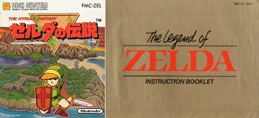
I’ve been playing the game Tunic quite a bit since it came out on the Switch earlier this month. The retro style adventure game is not just an homage to the original Legend of Zelda, but to old Nintendo manuals. I’d like to quote the developer, Andrew Shouldice, from an interview:
“I used to go to my next-door neighbour’s house, and they had the Metroid II Game Boy manual there… My friend would be playing the game while I leafed through the booklet. I was extremely young and didn’t understand a lot of the things it was talking about. But the magic of pursuing this document and soaking in all these illustrations and maps and tips, I think the intention is that it helps along that feeling of really puzzling through a mystery. Of finding true secrets.”
Andrew Shouldice, via RockPaperShotgun
Now, that spoke to me. Maybe this presaged my journey into UX design, but I loved those manuals. I distinctly remember as a kid making my own manuals with lists of made up bad guys in the style of Zelda or Super Mario 2. I would spend hours, just looking through the manuals, sucking up lore about the strange club that included Shy Guys and Snifits or detachable demonic dragon heads.

I think about those old manuals a lot now because of how modern products eschew them. Part of this is connected to the rise of digital downloads (no box, no paper manuals), but I think it also owes a lot to modern design thinking, especially as pioneered by Apple products. The iPhone or iPad, when you take it out of the box, is supposed to just work, to do what you expect, and to not need a manual.
And I’m not trying to attack this, this is good UX! You want your product, software or otherwise, to act in predictable ways. One of the main user experience bibles, Steve Krug’s “Don’t Make Me Think,” basically says it all in the title: the user should be able to reach their goal without having to think about it or get confused in the search. Perhaps the most relatable metaphor for non-UXey folks would be a visit to a grocery store for a specific item: if I want sugar, I should be able to guess which aisle it is in, and if I need to search more than two or three locations, or even go as far as asking for help, then it is a failure of the store’s “Information Architecture” in UX jargon.
The fact that the old games had manuals does NOT mean they lacked UX though. For instance, in the original Super Mario Brothers, the goomba was actually added late in the game so there could be a more basic enemy on which Mario could learn the basics: for bad guys, jump over or jump on. The design of goomba may be confusingly close to that of the super mushroom though, so the first such mushroom is placed in an area where it bounces back at you, and then comes at you under some blocks, so that its hard to avoid; thus, after you learn to avoid the goomba, you’re forced in a situation where you can’t avoid the super mushroom, so you can learn that it’s good for you.

In one sense, games are nothing BUT user experience design, in that they present obstacles in new configurations one at a time to teach mastery of new skills. You learn to walk before you learn to run, and you master the grassland before you try the ice world; or, back to Zelda, each dungeon introduces a new weapon or tool, then presents challenges to test their use. At the surface level, UX seems counter to game design, because UX is about removing obstacles while game design is about creating them, but if we think of games as systems for teaching (and here I’m drawing heavily on Raph Koster’s ‘Theory of Fun for Game Design’), then game design becomes designing tests to that end while removing obstacles to accessibility or immersion. Games are just the right amount of obstacle to find our flow, in Csikszentmihalyi’s terminology. This is also similar to my thoughts on UX for education: don’t make me think about the interface so I can just think about the material.
So I guess I’m interested in the manual as a physical artifact for the purposes it does serve, in this case, I guess you could call it worldbuilding. This was particularly important in old games because of the technological limitations: I guess I can tell what bats and skeletons are, but why am I fighting a lasagna? And if you think about it, the way Apple eschews the manual is also part of their “worldbuilding,” and their story is effortless technology.

Elsewhere in the interview quoted above, Shouldice talks about the challenge level of the game, “Nintendo hard,” as a necessary requirement to create the intended feeling in the player, that of bravery for overcoming obstacles. This is also interesting in light of the other game I’ve been playing on Switch, Metroid: Dread, which uses the difficulty of escaping invincible adversaries for a different effect, horror. So, the same mechanics can be used to very different effects, and the pieces of worldbuilding help us to interpret the experience.
As I’ve seen my oldest kid play games, I’ve started to appreciate how they offer worlds for his imagination to roam, so much that he will ask to play Mario and Zelda “not on TV.” The manuals, with their menageries of villains, helped guide me into those sorts of imaginary worlds too, though I didn’t realize at the time.